A Conversation with Mark Steinmetz
 By Joerg Colberg
Dec 8, 2009
Having spent a lot of time with Mark Steinmetz’s books South East and Greater Atlanta, I was curious about the history and photographer behind the work. So I asked Mark for an interview, and much to my delight he agreed to it.
 Jörg Colberg: “Greater Atlanta”, a book of photograph taken around that city, was just published, thus finishing a trilogy of books (the other two being “South Central” and “South East”). Can you tell me a bit about the history of the work that went into these three books?
Mark Steinmetz: The word “trilogy” makes me think of wizards and elves. One friend suggested, since I was uncomfortable with that word, that I call the three books a “triumvirate” but of course that’s even scarier sounding and makes me think of ancient Rome. So I suppose I’ll have to go along with “trilogy.”
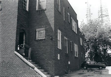
“South Central” is the earliest work - I began it in the fall of 1991 when I first moved to Knoxville and I worked on it for a little less than two years. “South East” and “Greater Atlanta” both began with my subsequent move to Athens, GA in late 1993. The work from “South East” stops around 2001, while in “Greater Atlanta” the most recent photograph is from this year.
JC: I suppose I should have been maybe a bit clearer with my question: Did the idea of producing such a series of books always exist, or is the “trilogy” (triplet?) simply just the way the work was published?
MS: “Triplet” makes me think of too many babies coming out all at the same time and the world’s population problems. It won’t do.
For a long time it was unclear if I would even be able to make a single book. The first publishers I approached were enthusiastic but they wanted me to raise the money myself which wasn’t something I was willing (or really felt able) to do. Then there was the fear that somebody would someday actually offer to publish a book but that it would be a mere collection of the most easily likeable images and what would my response to that be?
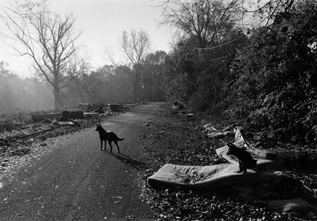
I had considered making a book with chapters - the first being called “Knoxville” and then the second “Athens” but when I started digging into the Knoxville work it became apparent it needed to be its own book. With “South East” I noticed many pictures from Athens fit together very well with photos from Memphis or New Orleans and other spots in the south. That work features a lot of photos of young people and has a pastoral feel in places. The “Greater Atlanta” work is a bit more about our crazy capitalist car culture and has more urban scenes. I knew at the time I was taking pictures in different terrains and that it would probably be best to separate them somehow at some point but I didn’t know specifically how I would do that until I got into the darkroom to make the prints for the books. Fortunately for me, Nazraeli went along with all this. I guess they could have bailed out after “South Central.”
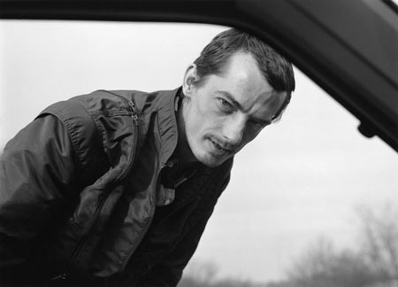
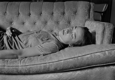 JC: I’m particularly impressed by the portraits in these books. I’m curious how you approach portraiture - what do you want to show? How do you approach people to take their photo?
MS: I want to show something of people’s inner lives. I think for portraiture you have to be completely certain that you are interested in photographing this or that person. You can’t be wishy-washy in your motivation. You just have to know that you want to photograph this person and it’s a kind of knowing that eradicates any asking of “why?” My approach is fairly low-key. I don’t want to make waves. I’ll just ask something like “Can I photograph you as you are?” Sometimes I’ll give a little direction like “look over that way” but it’s never elaborate. Having an ability to focus and concentrate is necessary for making good portraits.
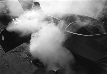
JC: “Greater Atlanta” seems most diverse, with its mix of portraiture and landscapes. It also contains the most recent work. Is this an indication of your own focus developing or changing?
MS: Not really. All the books mix portraits and scenes and animal photos. I also have long-shots and close-ups, daytime and nighttime photos. It’s just what I do. I’d make a very bad German photographer, always photographing the same thing the same way.
 JC: The work was all shot in b/w - stunningly beautiful in these books. Why b/w? What attracted you to b/w, or: Why not work in colour?
MS: When I began to photograph in the early 80s, I mostly looked at b/w photographers such as Winogrand and Friedlander. Most of the exciting work was in b/w, though you could find stacks of remaindered copies of Eggleston’s Guide at the MoMA bookstore, and photographers like Joel Sternfeld were starting to come out with books. Color photography was very laborious in those days - you had to process your photos in these tedious tubes. It took forever. Then that changed seemingly overnight when schools brought in color processors. Color printing suddenly became very easy to do - your prints would just pop out of these machines in seven minutes or so. Also, there were no longer any real restrictions on the size of the prints. The trouble though was that you really had to be associated with a school because nobody could afford to buy and maintain a processor on their own. I knew I wanted to be independent - that is, to not be dependent on having some continuous university affiliation in order to process my pictures. Also, there are very serious problems for me with the type C print. They’re made on plastic, not real paper, and the dyes yellow or shift to magenta in time. They improved on that a bit in the 90s but most of the color work from the 80s has deteriorated somewhat. Today’s digital ink prints take some getting used to but they’re more archival and you have more control over how the colors turn out. I have no technical issues with color photography when the images are printed well in a book.
 To talk about the differences between b/w and color is to risk getting into the fuzzy realm of generalizations. Let me mention a few examples from the early 80s to talk a little about b/w photography and how it works for me. MoMA’s series on Atget and Lee Friedlander’s “Factory Valleys” are wonderfully printed books which demonstrate how richly b/w can describe weather, season, light, and time of day. Perhaps it’s because the color is withheld that you have to activate some sort of poetic imagination in order to read the work. I can feel the effect of sun hitting skin more palpably in Tod Papageorge’s silvery Central Park pictures than in any color picture of someone basking in the sun. There is something excitingly difficult and complex and intellectual in Garry Winogrand’s “Public Relations” (1977) and I’ve yet to see any similar ambition in color as tough-minded. Winogrand doesn’t seem to be in a hurry to please anybody. Color photography tends to not want to be too messy and it prefers sedate light (please excuse the generalization.)
You might think from all this that I don’t like color photography very much, but you’d be wrong. I love color photography! I’ve shot a lot of color over the past decade but as I don’t have a color darkroom or a half-decent digital set-up, I haven’t done much with it. Come to think of it, I sure hope my negatives aren’t deteriorating. I had toyed with the idea of mixing in color with b/w in “Greater Atlanta” but it always seemed like the color photos next to the b/w were too jarring. B/W photography has stillness about it; things can kind of rest, even in an embrace of chaos.
Of course nowadays color’s takeover of photography is just about complete. Perhaps only those who work in b/w can make their way to b/w’s deeper poetry and secrets. Maybe it’s time for b/w photographers, like those weary elves in the end of that other trilogy, to trudge off the stage and head to some other distant shore.
 JC: Well, I’ve heard photographer friends talk about a “rennaissance” of b/w that was due or about to happen. People have certainly become saturated as far as large colour prints are concerned, and it’s not hard to see why. Maybe b/w elves don’t need to trudge off the stage after all? With so much colour work around maybe it’s time to show what b/w can do? After all, there is no real reason why the most exciting work should always be in colour?
MS: I think a lot of superlative work in b/w has been done in the past decade. Mostly this work has been done by well-established people in their fifties and sixties. I can’t really gauge how much attention the work has received but my guess is not so much. I’m not so aware of younger people in their thirties working in b/w. If they end up choosing to do so, I hope they work in a way that is not nostalgic or overly romantic and pictorial. Maybe Atget, Brassai, and Kertesz have reincarnated and are among us trying to figure out the next step.