Examples of Photography Content Management on the Web
 By
By 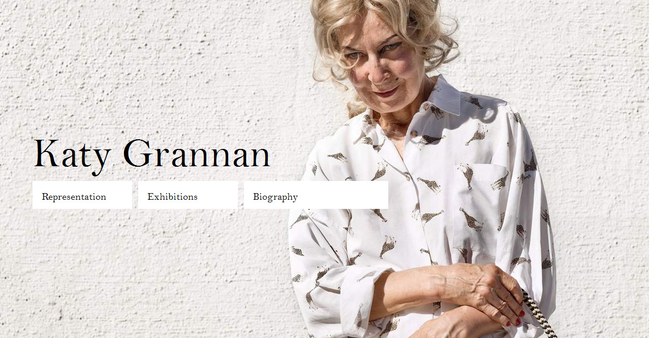
In an earlier article, I argued that it’s essential for photographers to carefully take the presentation of their work online into consideration. Instead of keeping things mostly theoretical, I thought I’d follow up with an article discussing examples. There probably will be considerable disagreement about what is the best presentation of photography on the web, but the following list might serve as a starting point for more discussions. Of course, the list is not supposed to be representative or complete in any kind of sense. (more)
The easiest way to present your work online is simply not to do it at all. I’m a huge fan of Katy Grannan, but I’m not so impressed by the fact that to see her work online I have to go to the website of one of her galleries. Not having your work online (or leaving it up to your galleries to show whatever they deem showable) of course is one solution how to approach the problem. However, this might not work for everybody (in particular if you’re not well know and/or don’t have a gallery). The question, of course, is: Do I have to show my work online? And the answer is: No, you don’t. While it’s not quite as clear as the social-media-hype machine wants you to believe what you gain from having a web presence, it seems very obvious to say that it’s not a bad idea at all to have one.
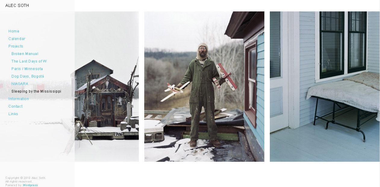
Alec Soth’s Sleeping by the Mississippi is one of the most influential photobooks of the early 21st Century. On his website, Soth presents the project/book in a straightforward way: The viewer can see the photographs by scrolling from left to right. Having looked at websites for over ten years now, I think that that’s probably the simplest and most effective way to showcase photography. It gives the viewer the option to determine the viewing experience in a pretty obvious way.
That said, I’ve heard people complain about being able to see more than one photograph. It seems safe to say that there will always be somebody who will not be happy about the presentation. When thinking about a web presence I think any artist would be ill-advised to try to make everybody happy (an impossible goal). Instead, an artist needs to think about what might be the best way to showcase her or his work.
Recently, Soth has also experimenting with some of the opportunities offered by sites like Tumblr. On LBM Dispatch, Soth publishes images - alongside text by Brad Zellar - taken on road trips through various parts of the US (at the end of each trip, the results are then published on paper using newsprint). Given that the various posts don’t necessarily have to be seen in sequence, they can be reblogged and reshuffled without losing anything.
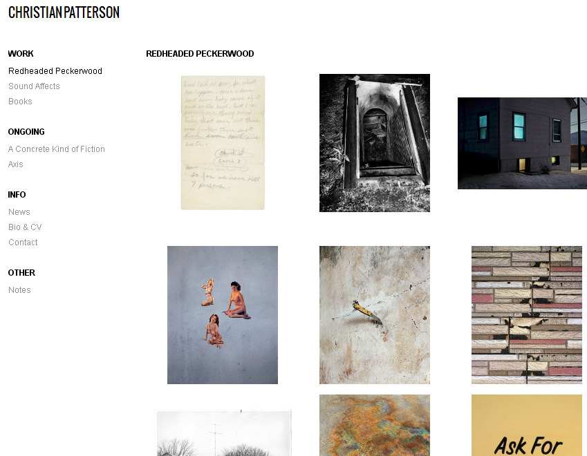
Speaking of influential books, Christian Patterson’s Redheaded Peckerwood might have just taken over as the photobook a lot of photographers want to emulate. On his website, Patterson presents the book essentially as a collection of thumbnails. You can click on an image and see it bigger and then move forward or back as well. A simple way to present photography, it does the images justice, but I don’t think it serves to showcase the book itself very well at all. Needless to say, it’s not quite obvious how one would go about translating a book like Redheaded Peckerwood onto the web - this essentially is the challenge that I tried to outline with the previous articles about online content management and the shortcomings of so many popular web platforms (such as Tumblr).
As far as an online presence is concerned, one size won’t fit all. Sleeping by the Mississippi and Redheaded Peckerwood are very different books, and it’s unlikely that the same presentation would serve both equally well. So the idea here is not to say that “this presentation is better than that one.” Instead, I’m trying to address whether a given presentation - in my opinion (your mileage might vary) - serves a particular body of well well or not.
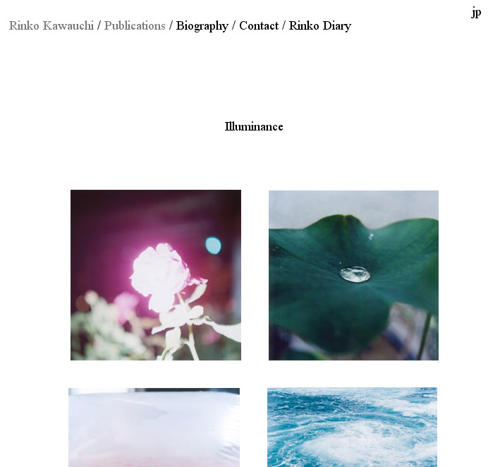
Rinko Kawauchi’s approach to showcasing work from Illuminance uses the same approach as Patterson, except there are way less photographs, but there is part of the publisher’s press release underneath the images. Using just a handful of images as a teaser for a book avoids the problem of the presentation of the work. But still… I can’t help but think that the small grid of images does the work a disservice in the case of Kawauchi’s photographs. For this type of photography, seeing just one image (large enough so that the viewer can appreciate its beauty) at a time might be a much better solution.
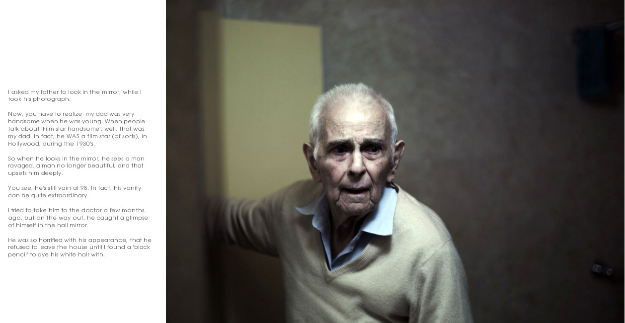
A very different type of book, Philip Toledano’s Days with my Father has its own microsite. A separate website dedicated to just one project/book is not such a bad idea, but once you have too many, separate sites people might get confused. But that seems like a minor problem as long as your mail site connects everything (as Toledano’s does). The Days with my Father site works very simply: You scroll through its content from top to bottom, by clicking at, well, the top or bottom. The layout is very simple, yet effective: One image per spread, with optional text on the side. This approach avoids the sheer goofiness of the fake pages on sites like Blurb or Issuu, while essentially presenting the book.
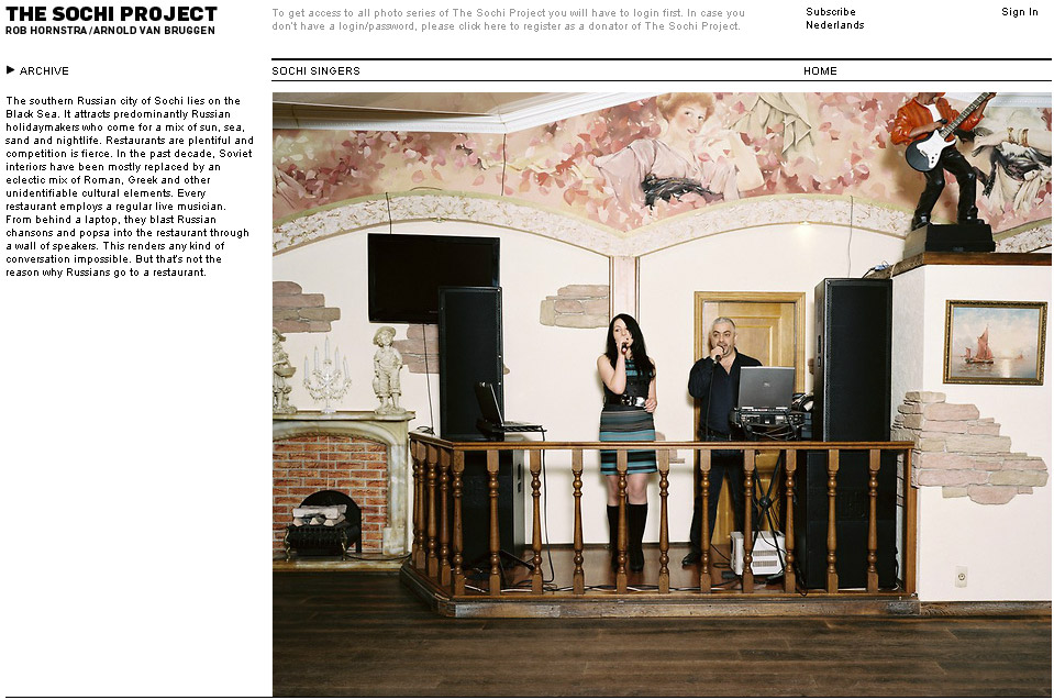
A different, yet also very simple approach was used by The Sochi Project’s Sochi Singers. The images are shown in a slide show that will advance on its own. On top of that, the viewer can use arrows or thumbnails to select images. I think giving the viewer the option to control the flow of images her/himself is essential - I personally find websites that show images in a way I can’t control extremely offputting.
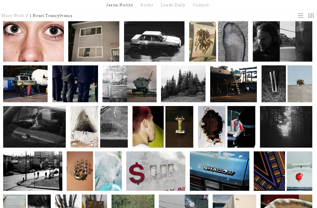
Bryan Formhals pointed me to Jason Nocito’s I Heart Transylvania. There is a book, which unfortunately I don’t know. The website offers either a simple top-down scrolling version (essentially a Tumblr experience that does not give you the option to reblog anything) or a thumbnail-grid version (where there are so many images that you have to scroll your way through as well). I prefer the former over the latter by a mile.
There might be something to be said for showing your photographs as thumbnails, flooding the screen, but whatever that might be I think the only work for which this approach might work well is a typology. For everything else, a screen filled with tons of small thumbnails in a grid is just supremely unattractive. It’s not even that I don’t have the patience to look at such a grid of images, it’s simply that to me it’s sending a message that I don’t necessarily want to get: “I’m just going to throw everything at you.”
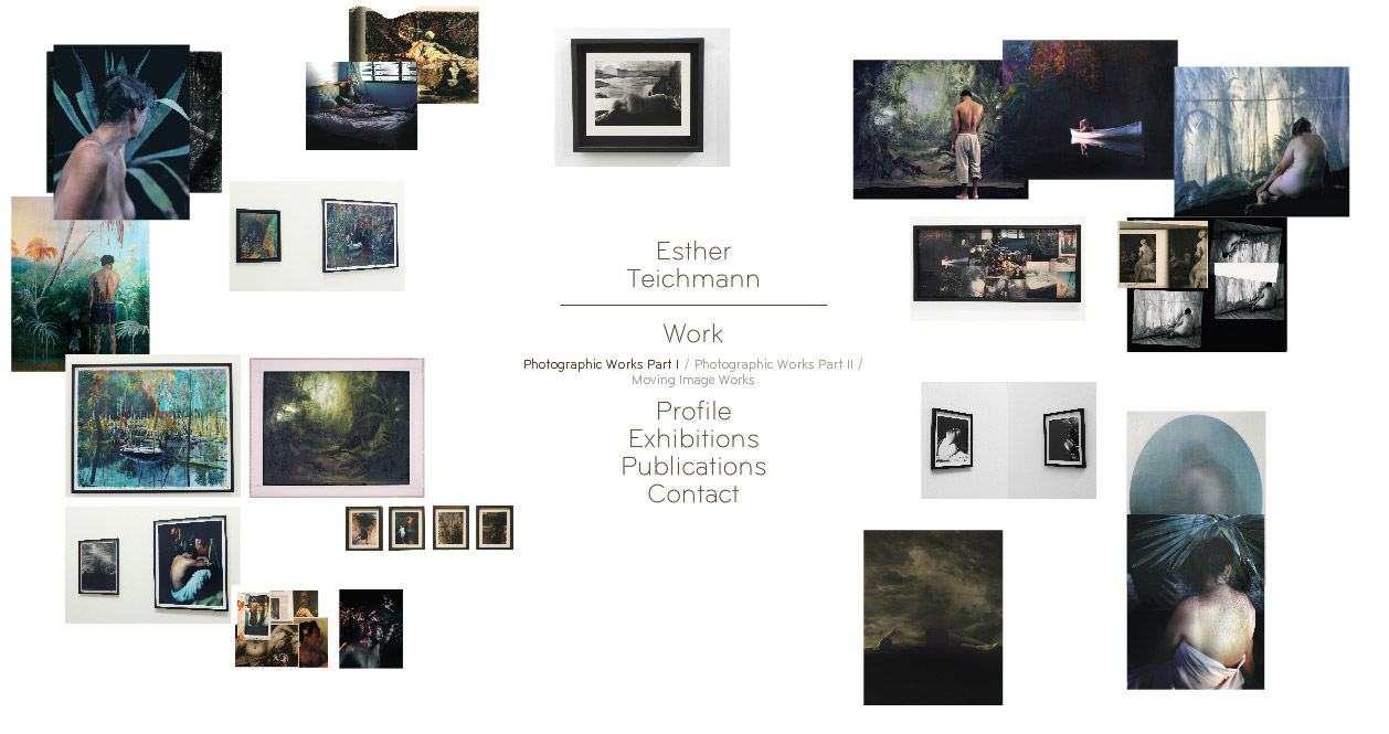
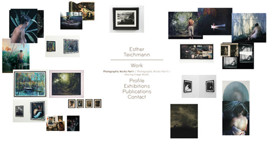
A very different feel is achieved by Esther Teichmann’s website. When you look at the images, their placement seems random, and it actually is. Re-visit the site, and the images are in different spots. You can click on the thumbnails to see them bigger. It’s obvious that this approach won’t work for each and every body of work, but in Teichmann’s case it works very well. It’s interesting that the seeming lack of intent in Teichmann’s case (random positions) makes the site look so much more intentional that than the very clearly and neatly layed-out thumbnail page by Nocito.
We could go through a whole lot more websites, but what has probably become clear here are two points that we might be able to agree on: An artist has to think carefully about how to present her or his photography online, ideally in such a way that the presentation serves the work (and not the other way around). Second, the viewer’s personal preferences do enter, so you can’t possibly make everybody happy. I expect to change website preferences with time - as they have changed over the past few years. But given the web is old enough now and we’ve been through quite a few stages (remember the Flash frenzy?), I’m cautiously optimistic that the game has shifted from trying to follow the latest fad to creating a web presence that makes one’s work truly shine.